
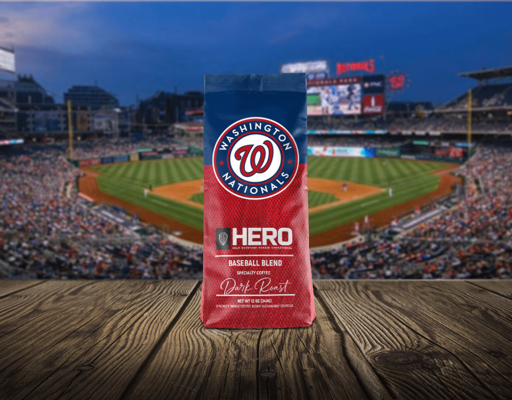
The Shelf Is a Battlefield
Walk down any aisle at Walmart, Target, or Costco and you'll understand immediately why packaging design is not a luxury — it's a survival requirement. A typical big-box retail shelf holds dozens of products in the same category, all competing for the same shopper's attention within the same square foot of real estate. The average consumer spends less than three seconds scanning a shelf before their eye stops on something or they move on.
In that three-second window, your packaging must accomplish an extraordinary amount: communicate what the product is, signal its quality and price tier, differentiate itself from competitors, and emotionally resonate with the target consumer. No sales rep is standing there to explain. No video plays. No landing page loads. It's just your box, your bag, your bottle — and the story it tells in an instant.
First Impressions Are Purchase Decisions
Neuroscience research consistently shows that purchasing decisions at retail are largely emotional and subconscious. A consumer may rationalize a choice after the fact — "it had better ingredients," "the price was right" — but the initial impulse to pick up a product is almost always driven by how the packaging makes them feel. Color psychology, typography, material texture, and structural form all contribute to the emotional response a consumer has to your product before they've read a single word.
This is why premium brands invest heavily in packaging that conveys sophistication through matte finishes, embossed details, and restrained color palettes. It's why natural and organic brands use kraft paper textures, earthy tones, and hand-drawn typography. And it's why budget brands use bold primary colors and large benefit callouts — because their shopper is making a fast, value-driven decision and needs instant clarity. Every design choice is a signal to a specific consumer about whether this product is "for me."
What Retail Buyers Look for in Packaging
Before your packaging ever reaches a consumer, it has to impress a retail buyer. Buyers at major chains like Kroger, Costco, Target, and Home Depot are evaluating hundreds of products every buying cycle. When they assess your packaging, they're thinking about several key factors that go far beyond aesthetics.
- Shelf presence: Does this packaging stand out in a planogram mockup? Will it catch the eye when surrounded by competitors?
- Brand clarity: Can a shopper tell what this product is within two seconds? Is the brand name prominent and memorable?
- Structural integrity: Is the packaging retailer-compliant? Does it stack efficiently, fit standard shelf depths, and survive the supply chain without damage?
- Consumer information: Does it clearly communicate key benefits, usage instructions, and compliance information without being cluttered?
- Sell-through potential: Does this packaging look like something consumers will actually buy, or will it sit on the shelf and create an inventory problem?
Buyers who have seen thousands of products can assess packaging quality almost instantly. Weak packaging signals a weak brand — and a risky bet for their shelf space. Strong packaging signals a brand that has done its homework, understands its consumer, and is ready for retail.
The Elements of High-Performance Retail Packaging
Creating packaging that performs at retail requires a specific set of design disciplines working in concert. It's not enough to have a beautiful logo or a well-chosen color palette — every element must be engineered for the retail environment.
Hierarchy of information is perhaps the most critical structural element. The consumer's eye should naturally flow from brand name → product type → key benefit → supporting details in a deliberate sequence. Packaging that tries to communicate everything at once communicates nothing. The best retail packaging is ruthlessly edited, prioritizing the two or three things that will most influence the purchase decision.
Color strategy must account for the competitive set. Before finalizing a color palette, TOLA's design team always analyzes the existing shelf — mapping competitor colors to identify either opportunities to align with category conventions or to differentiate through deliberate contrast. A product that "owns" an unexpected color on a monochromatic shelf can dominate visual attention without increasing marketing spend.
Typography does more than convey information — it establishes brand personality. The difference between a serif and a sans-serif, a condensed and an expanded letterform, can shift consumer perception from "artisan and premium" to "modern and accessible" without changing a single word. Typography choices must also be legible at distance on the shelf and at small sizes on the package back.
Packaging as an Omnichannel Asset
In today's retail landscape, packaging design must perform across multiple contexts simultaneously. The same package that needs to win on a physical shelf at Target also needs to photograph brilliantly for an Amazon product listing, render clearly as a thumbnail on a Walmart.com search results page, and look compelling in a social media unboxing video.
This omnichannel requirement changes how TOLA approaches packaging design. We evaluate every design in multiple contexts: under retail fluorescent lighting, in product photography with controlled studio lighting, as a small digital thumbnail, and as a lifestyle image on Instagram. A design that fails any of these tests is a design that leaves revenue on the table somewhere.
The most successful consumer brands treat packaging as a strategic asset that anchors the entire brand expression — from the physical shelf to the digital storefront, from the unboxing moment to the brand impression that lives in the consumer's memory long after the product is used. Investing in world-class packaging design is not a cost. It is the highest-return investment a consumer brand can make.
How TOLA Approaches Retail Packaging Design
At TOLA, packaging design is never an isolated creative exercise. It is the culmination of a rigorous strategic process that begins with category analysis, consumer insight, and competitive mapping — and ends with packaging that is optimized for sell-in with buyers and sell-through with consumers.
Our team has designed retail-ready packaging for brands across consumer electronics, food and beverage, health and wellness, home goods, automotive accessories, and licensed products. We've partnered with iconic brands like Disney, Marvel, and Sanrio, and we've helped emerging brands break into Costco, Walmart, Target, and specialty retailers for the first time. In every case, great packaging was not just part of the story — it was the reason the story got told at retail at all.
Ready to Win on Shelf?